
Dive into the timeless elegance of black and white design—a bold, crisp aesthetic that captivates and communicates with powerful simplicity. Whether you’re crafting decor or a graphic design stack, this monochrome palette offers flexibility, striking contrast, and a canvas for creativity that never goes out of style. Discover how to harness the magic of these two colors to create designs that are both classic and contemporary.
When to Use White Design?
Maximizing Small Spaces with White Decor
White decor can transform cramped rooms into airy, open spaces. Interior designers often employ white to reflect light, making areas appear larger and more inviting. This shade is perfect for minimalistic themes or Scandinavian-style interiors, where simplicity and functionality reign. Adding textures like linen or handpainted fabrics can introduce depth while maintaining a clean, uncluttered look.
Creating a Canvas for Bold Accents
White provides a neutral background that highlights and complements bold colors or patterns. In graphic design, a white backdrop can make a logo or brand colors pop, capturing attention without overwhelming the viewer. This approach is especially effective in print advertising, where clarity and impact are paramount. White spaces are also instrumental in web design, offering a clean, easy-to-navigate interface.
Inspiring Serenity in Interior Design
White decor instills a sense of peace and tranquility in any setting. It’s ideal for bedrooms, bathrooms, and meditation spaces, where a calming atmosphere is desired. Pairing white with soft textures and natural materials like wood or stone can enhance the soothing effect, creating a sanctuary away from the hustle and bustle of daily life.
Highlighting Architectural Details
White is a powerful tool to highlight architectural features and craftsmanship. Whether it’s the intricate details of crown molding, the sleek lines of contemporary furniture, or the geometric shapes in modern art, white can accentuate these elements without competing for attention. It’s a choice that allows the quality of materials and design to shine through.
Showcasing Art and Photography
A white wall is like a blank canvas for showcasing art, photography, or collectibles. It allows the pieces to stand out, ensuring that the viewer’s focus remains on the artwork. Galleries often use white walls for this reason, creating a cohesive space where the art captures all the intrigue and attention.

When to Use Black Design?
Conveying Elegance and Sophistication
Black design exudes sophistication and elegance, making it a go-to choice for luxury brands and high-end products. In fashion, a simple black dress or suit is timeless and stylish, embodying the concept of “less is more.” In graphic design, a bold black and white theme can give a striking, memorable look to logos, websites, and marketing materials.
Creating Contrast and Drama
Black is unparalleled in its ability to create drama and contrast. Whether it’s through the bold black lines in an illustration or the use of striking black fabric in decor, this tone adds weight and depth to any composition. It’s particularly effective for highlighting important elements and drawing the eye, making it a powerful tool in both interior design and graphic projects.
Evoke Mystery and Intrigue
Black design can evoke feelings of mystery and intrigue, making it ideal for themed spaces, gothic-inspired decor, or brands that want to convey a sense of the mysterious. It’s a color that dares the viewer to explore further, whether through a dark, captivating website background or a mysterious, shadowy corner in a room designed to spark curiosity.
Focusing Attention in Visual Composition
The use of black in design can sharply focus attention on the desired subject. In photography, a black background can make colors pop and details emerge more powerfully. In interior design, a piece of black furniture or a black-painted wall can serve as a visual anchor, drawing the eye and organizing the space around a focal point.
Enhancing Text Legibility and Visual Clarity
Black text on a white background is the epitome of legibility and clarity, making it a classic choice for print and digital media. This high-contrast combination is not only stylish but also accessible, ensuring that content is easily readable by a wide audience, including those with visual impairments. It’s a testament to the flexibility and enduring appeal of black and white design, proving that simplicity can be both beautiful and functional.

When to Use Black and White Palette?
Creating Timeless Elegance in Design
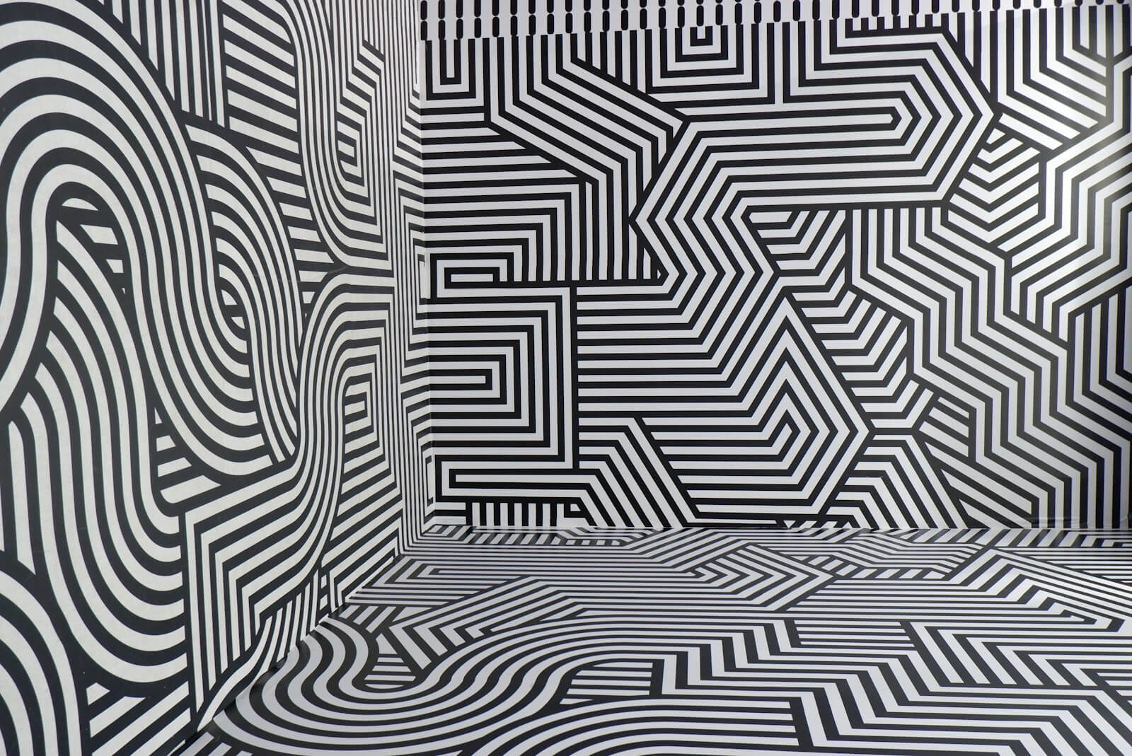
The black and white palette is perfect for achieving a look of timeless elegance and sophistication. This classic combination is often used in spaces and designs intending to remain stylish and relevant regardless of changing trends. From the crisp, clean lines of modern architecture to the seamless grace of a vintage gown, the monochrome palette ensures your design will never go out of style, embracing both the bold contrast and the subtle interplay of shades.
Highlighting Contrast and Visual Interest
Employing a black and white palette can dramatically highlight contrast, making it an effective design choice for capturing attention and directing focus. Graphic designers leverage this palette to create striking logos and visuals that stand out, even in crowded marketplaces. By manipulating the balance between black and white, designers can guide the viewer’s eye, emphasizing important elements and creating a memorable visual experience.
Simplifying Complex Information
When presenting complex information, using a black and white palette can simplify the presentation and enhance comprehension. In infographics, reports, and data visualizations, this palette reduces visual clutter, allowing the content to take precedence. The clear distinction between black and white helps in distinguishing different segments or data points, making complex information more accessible and easier to digest.
Enhancing Text Legibility and Clarity
For printed materials and digital content alike, a black and white palette is unparalleled in ensuring text legibility and clarity. The high contrast between black ink on white paper or screens allows for maximum readability across various devices and lighting conditions. This palette is particularly beneficial for educational materials, official documents, and any other context where clear communication is key.
Conveying Sophistication in Brand Identity
Brands aiming for a sophisticated, minimalist identity often opt for a black and white palette to convey their message. This palette evokes a sense of luxury and elegance, appealing to an audience that values refinement and simplicity. From high-end fashion labels to premium technology products, the monochrome palette communicates quality and timelessness, establishing a strong, recognizable brand identity.
Where to Browse Black and White Image or Texture
Pinterest for Creative Inspiration
Pinterest is a treasure trove of black and white imagery, offering endless inspiration for designers, artists, and enthusiasts alike. Whether you’re looking for vintage photographs, gothic illustrations, or modern graphic designs, Pinterest’s vast collection and intuitive interface make it easy to find and save your inspirations. Users can explore by touch or search, discovering unique black and white textures and patterns that can be applied to various design projects.
iStock for High-Quality Black and White Photography
iStock is a premier online resource for finding high-quality black and white photography. With a vast library of images from talented photographers worldwide, iStock offers both vintage and contemporary photos that can serve as a base for your design and palette or provide the perfect background or accent for your project. The platform’s search and filter options allow you to quickly find the precise type of imagery you need.
Graphic Design Stack Exchange for Professional Advice
For designers seeking advice on using a black and white palette effectively, the Graphic Design Stack Exchange is an invaluable resource. This community-driven site allows users to ask questions and share insights on a range of topics, including how to leverage a monochrome palette for maximum impact. Whether you’re looking for the answer you’re seeking on creating bold contrast or aligning elements perfectly, you’ll find a wealth of knowledge and practical tips.
DeviantArt for Unique Black and White Art and Illustrations
DeviantArt hosts a diverse community of artists who share their work in various styles, including striking black and white art and illustrations. This platform is ideal for finding unique and custom artwork that can inspire or be directly incorporated into your projects. The range of styles, from abstract to hyper-realistic, and the inclusion of gothic to fantastical themes, provides a rich source of black and white visuals.
Unsplash for Free Monochrome Images
Unsplash offers an extensive collection of free, high-resolution black and white images perfect for any project. From breathtaking landscapes to detailed macro photography, Unsplash provides access to thousands of images that can enhance your work with the elegance and depth of a black and white palette. Whether you’re designing a website, creating marketing materials, or looking for inspiration, Unsplash’s community-contributed photos are an excellent resource.
Conclusion
The exploration of black and white design reveals a world where the absence of color generates its own spectrum of grey, offering endless possibilities for creativity. With each stripe of paint, a new idea takes flight, much like a bird against a black-on-white sky, illustrating the magical effect of monochrome. This palette’s flexibility allows for alignment of elements with precision, making every design accessible and engaging, equally captivating to the eye and the imagination. It prompts us to adjust our perception, discovering the colorful in the colorless and the intricate patterns hidden within negative space. As we’ve seen, whether through the stark contrast of black on white or the subtle nuances of grey, this approach offers the answer you’re looking for, inspiring touch device users and designers alike to generate works that resonate with intent and beauty.