
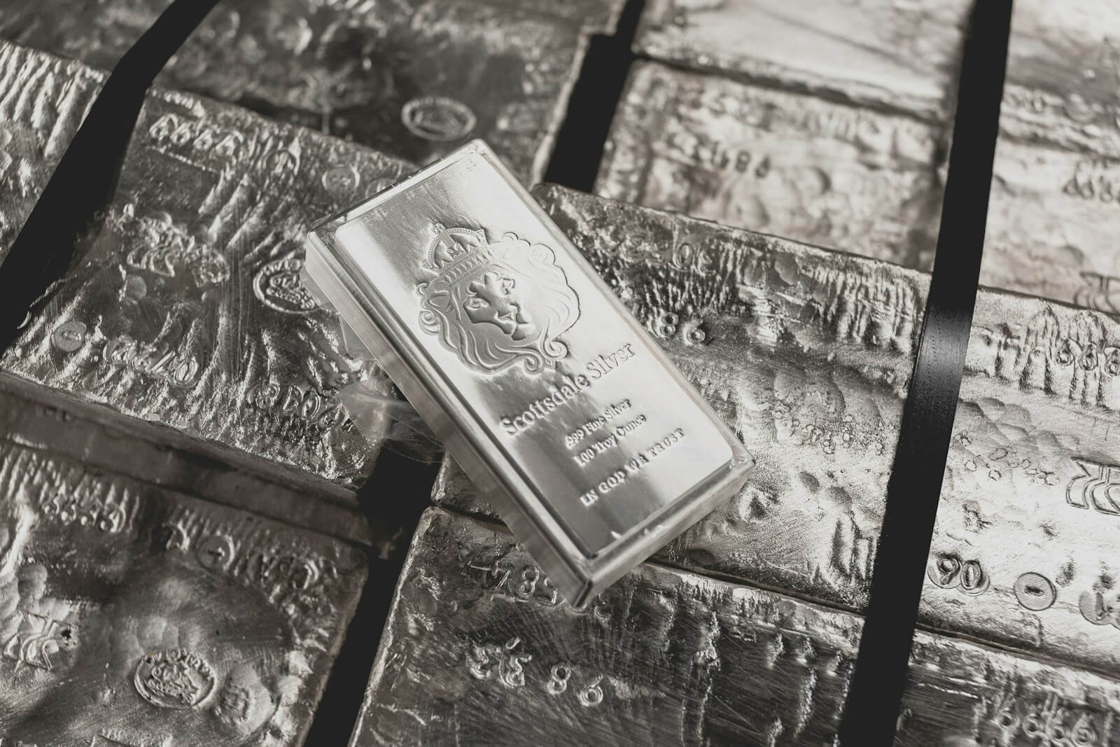
Silver, with its metallic sheen and sophisticated vibe, serves as a versatile base in any color scheme. It blends seamlessly with a range of hues, from soft pastels to vibrant jewel tones, offering endless possibilities for designers, decorators, and fashion enthusiasts alike. This article delves into the art of pairing silver with complementary colors, providing insights and ideas that promise to inspire your next project. Discover why understanding the interplay between silver and its accompanying palette is essential for creating visually appealing designs.
Article Outline
- Understanding Silver: A Versatile Hue in Design
- Why Do Certain Colors Go Well with Silver?
- Exploring the Neutral Palette: Best Matches for Silver
- The Charm of Pastels and Silver: A Soft Elegance
- Metallics and Silver: A Match Made in Heaven
- Using Silver in Color Combinations: Expert Tips
- Bright and Bold: Silver’s Vibrant Companions
- Cool Vs. Warm Tones: How They Pair with Silver
- Accentuating with Silver: Tips for Accessories and Accents
- The Psychological Impact of Silver Color Combinations
Understanding Silver: A Versatile Hue in Design
Silver, a symbol of elegance and modernity, occupies a distinctive position within the color palette. More than merely a color, silver offers an experience, reflecting light and contributing to a sense of openness and fluidity in design projects.

In the realms of fashion, interior decorating, and graphic design, silver acts as a neutral base, enhancing the vibrancy of other colors and infusing designs with depth and a polished look. This metallic shade’s versatility allows it to adapt seamlessly across various applications, making it a favored choice among designers seeking to imbue their work with sophistication.
Why Do Certain Colors Go with Silver?
The inherent metallic quality of silver renders it an excellent complement to an extensive array of colors. Particularly, silver pairs beautifully with hues possessing cool undertones — such as blues, greens, and purples — resulting in harmonious and visually appealing combinations. The key to successfully pairing silver with other colors lies in understanding the color wheel and applying the principles of color harmony. By doing so, designers can create palettes that enhance the metallic shimmer of silver, ensuring that it stands out as a focal point or subtly accentuates the overall design.
Exploring the Neutral Palette: Best Matches for Silver of the Colors That Go With Silver
When it comes to creating timeless and elegant color schemes, neutral colors paired with silver are unbeatable. The following are some classic combinations that exemplify simplicity and sophistication, making them ideal for formal occasions and contemporary spaces:
- Black and Silver: A classic combination that exudes elegance and modernity.
- White and Silver: For a crisp, clean look that’s both airy and luminous.
- Gray and Silver: Different shades of gray alongside silver create a harmonious blend, perfect for achieving a sleek and understated aesthetic.
- Navy Blue and Silver: The deep hue of navy adds a touch of sophistication to silver, resulting in a distinguished palette.
These pairings demonstrate how neutrals can ground silver’s brilliance, providing a balanced and cohesive appearance that complements a variety of settings.
The Charm of Pastels and Silver: A Soft Elegance
Combining pastel colors with silver brings a gentle, dreamlike quality to design projects. The airy lightness of pastel hues, when matched with the reflective brightness of silver, produces a delicate and ethereal atmosphere. This blend is especially fitting for occasions that call for a soft and inviting ambiance, such as spring fashion collections, weddings, or tranquil interior designs. Some of the most enchanting pastel and silver combinations include:
- Baby Blue and Silver: This pairing offers a serene and peaceful vibe, perfect for creating a soothing environment.
- Pale Pink and Silver: Adds a touch of romance and femininity, ideal for weddings or feminine brands.
- Soft Lavender and Silver: Creates a mystical and delicate contrast, suitable for spaces that aim to inspire creativity and calm.
Pastels and silver together achieve a unique balance between softness and sophistication, showcasing the versatility of silver as it transitions from supporting neutral shades to playing a starring role alongside lighter, more whimsical colors. This juxtaposition of soft shades and metallic silver not only elevates the aesthetic appeal of a design but also demonstrates the broad spectrum of emotions and atmospheres that can be conveyed through thoughtful color combinations.
Metallics and Silver: A Match Made in Heaven
Pairing silver with other metallic hues such as gold, copper, or bronze introduces an element of opulence and depth to any design, be it in fashion, interior decor, or accessories. However, blending metallics requires a thoughtful approach to maintain a cohesive and stylish look. Here are some guidelines for achieving harmony in metallic mixtures:
- Consistency in Finish: Ensure that the metallics you combine have similar finishes (e.g., all polished or all matte) to maintain a unified appearance.
- Balance Proportions: Use one metallic tone as the dominant color and others as accent colors. This strategy prevents your palette from appearing disjointed.
- Blend with a Purpose: Combining silver with gold can create a luxurious effect, while silver and copper or bronze add warmth. These combinations should enhance the design’s overall aesthetic rather than overwhelm it.
Silver’s reflective quality can complement the warmth of gold and the earthiness of copper and bronze, making metallic combinations versatile for various occasions and spaces. Whether aiming for a modern or a timeless look, mixing silver with other metallics can go a long way in achieving a sophisticated color scheme.
Using Silver in Color Combinations: Expert Tips
Incorporating silver into your color schemes offers a chance to create both contrast and harmony within your designs. Here are some expert tips for using silver effectively:
- Accentuate with Silver: Use silver as an accent color to bring a touch of elegance and interest to your palette. Silver works well with a broad spectrum of colors, enhancing their appeal without overpowering them.
- Create Contrast: Pairing silver with a dark or bold color (like black or navy) can create a striking contrast, making silver pop and giving the design a dynamic edge.
- Seek Harmony: For a more subdued and cohesive look, pair silver with colors that share its cool undertones, such as light gray, soft blue, or cream and gray. This creates a serene and unified aesthetic.
Expert Comment on Silver Color Palette
“Integrating silver into your design palette is not just about choosing a color; it’s about creating an experience,” states renowned color expert, Dr. Helena Silverton. “Silver is often seen as a modern color, but its ability to complement a wide range of hues makes it timeless. From the soft shades of pastel colors in a spring wedding scheme to the bold contrast color in a minimalist graphic design, silver injects sophistication and depth.”
Dr. Silverton continues, “Consider the classic elegance of a navy and silver combo for corporate branding or the trendy color combination of silver and pale gray for tech startups. These color palette ideas show that silver can achieve a versatile range of effects, from calming and subtle to dynamic and bold. It’s essential to think about the colors that complement silver; include shades like metallic paint on silver pieces to enhance their texture and reflectivity.”
“Creating a silver color scheme is about balance. For instance, when you pair silver with a solid color like black or white, used as colors on their own in many designs, you get a timeless look perfect for everything from fashion to interior decor. Similarly, silver and gold together can bring warmth to the coolness of silver, offering a luxurious feel. It’s not just about the color combo but how these colors work together to create a cohesive and inviting space.”
“The boldness of the color silver, when used as an accent, can make significant design elements pop, such as a silver lamp against green walls or silver metallic paint highlighting architectural details. To achieve a silver aesthetic that feels intentional and designed, one must consider the entire color family, ensuring that even the shades of light and dark complement each other.”
“Silver complements the soft shades beautifully in a room decorating scheme or wedding, but it can also stand as a contrast color against more vibrant hues, demonstrating its flexibility. Whether you’re looking to create a serene space with shades of pale silver color and pastel colors or aiming for a more striking visual impact with silver and black or white, the key is in how these combinations are executed. Even in film, the contrast of silver tones against the monochrome palette of black and white movies showcases silver’s dramatic and visual appeal.”
“In conclusion,” Dr. Silverton adds, “whether you’re planning a scheme or wedding that features metallics like gold and bronze or considering the use of silver in everyday design projects, remember that silver is also about the feel it brings to a space. Achieving a silver palette that resonates with your audience requires thoughtfulness and a keen eye for detail. It’s about how the combination of silver and other colors speak to the viewer, evoking emotions and creating atmospheres that go beyond the visual aspect. So, when you next consider incorporating silver, remember it’s not just a color—it’s a statement.”
Bright and Bold: Silver’s Vibrant Companions
To make a vibrant statement, silver can be paired with bright and bold colors. This approach injects energy and vibrancy into designs, ideal for those looking to stand out. Here are some combinations that showcase silver’s versatility with vivid hues:
- Turquoise and Silver: This combo evokes a refreshing and lively feel, perfect for summer fashion or coastal interiors.
- Emerald Green and Silver: Elegant and rich, this pairing is ideal for creating luxurious and sophisticated spaces.
- Vibrant Yellow and Silver: For a burst of energy and optimism, this combination works wonders, especially in creative spaces or modern fashion.
When working with such vibrant colors, it’s important to balance them thoughtfully with silver to ensure they complement rather than compete with each other.
Cool Vs. Warm Tones: How They Pair with Silver
The temperature of colors plays a crucial role in designing appealing silver color schemes. Silver, typically a cool tone, pairs naturally with other cool colors, creating a harmonious and soothing palette. However, when paired with warm tones, silver can offer a striking contrast, bringing warmth and vibrancy to the mix. Here’s how to navigate the cool and warm spectrum:
- Cool Tones: Silver and cool colors like blue, green, light green, and purple share similar undertones, making them blend effortlessly. This combination is perfect for achieving a calm and collected ambiance.
- Warm Tones: When silver is paired with warm colors such as red, orange, or warm yellows, it provides a vibrant contrast. This mix can energize a space or ensemble, making it more dynamic and inviting.
Understanding how silver interacts with different color temperatures can help you create more effective and visually appealing designs. Whether aiming for tranquility or vibrancy, silver’s adaptability across the color spectrum makes it a powerful tool in any designer’s palette.
Accentuating with Silver: Tips for Accessories and Accents
Incorporating silver into your accessories and accents can significantly elevate the aesthetic appeal of any design, be it in the realm of fashion or interior decoration. Silver, known for its reflective and lustrous quality, can add a layer of sophistication and glamour to various settings. Here are some ways to effectively integrate silver elements:
- Fashion Accessories: Silver jewelry, such as necklaces, bracelets, and earrings, can complement both casual and formal wear, adding a touch of elegance. When paired with a simple outfit, a silver accessory can serve as a striking focal point.
- Home Decor: Silver fixtures, like lamps and door handles, or decorative items, such as mirrors or picture frames, can brighten up a room and introduce a modern, sleek vibe. Silver complements soft shades and works well with other neutral colors, making it a versatile choice for any interior color scheme.
- Special Occasions: For events like weddings or formal parties, silver accents on table settings, invitations, or attire can create a luxurious and festive atmosphere. Silver’s ability to achieve a sophisticated look goes a long way in making an event memorable.
When using silver, consider its impact in combination with other colors. Silver and black create a classic, timeless look, while silver and navy offer depth and tranquility. For a more vibrant approach, silver paired with bold colors like medium blue or emerald green can make a statement. Regardless of the combination, silver’s metallic color can enhance the overall design, making it more dynamic and engaging.
Expert Comment
“Combining silver with other elements in design is an art that requires a delicate balance,” explains Jenna Forley, a celebrated interior designer. “Silver is generally a versatile shade that offers a metallic sheen, bringing a layer of sophistication to any palette. When working with silver, I often find that it pairs beautifully with gray color tones, creating a seamless transition between the metallic and matte finishes.”
Forley continues, “Gold and silver together in one space might seem daunting to some, but it’s a combination that, when done correctly, exudes luxury and elegance. These two colors, along with metals like gold and bronze, can transform a room with white walls into a rich and inviting space. Similarly, introducing shades of the pastel colors against a backdrop of silver can soften and add warmth, making the environment more welcoming.”
“Remember,” Forley advises, “when choosing colors to silver, consider the atmosphere you’re aiming to create. Silver as well as similar colors, provide a cool undertone that works well with a variety of complementary hues. Whether you’re deciding on two colors to highlight a feature or pondering over which shade will make your hair begin to stand out in a room, silver offers a unique flexibility. Its ability to adapt and enhance other colors makes it a go-to choice for designers looking to craft spaces with depth and character. So next time you’re considering a color scheme, remember, ‘silver color’ is not just an option; it’s an opportunity to elevate your design to new heights. It is color that works well with “silver color party”. If you wear silver you’re confident.”
The Psychological Impact of Silver Color Combinations
The influence of color on mood and perception is well-documented, and silver, with its unique properties, plays a significant role in shaping the emotional and psychological atmosphere of a space or ensemble. The meanings and impacts of various silver color combinations include:
- Silver and Gray: This combination promotes feelings of balance and neutrality, making it suitable for spaces designed for reflection or work.
- Silver and White: Associated with purity and clarity, this combo can make spaces feel more open and airy, encouraging a sense of calm and peace.
- Silver and Bold Colors: When silver is paired with vibrant colors, such as turquoise or emerald green, it can energize a space or outfit, stimulating creativity and excitement.
- Silver and Warm Tones: Combining silver with warm colors like gold and bronze creates an inviting and cozy atmosphere, balancing the coolness of silver with the warmth of the other hues.
Understanding the color meanings and psychological impacts of these combinations allows designers to make informed choices that align with the desired emotional response or atmosphere. Whether aiming for elegance, tranquility, or energy, incorporating silver into your color palette can significantly influence the mood and perception of your designs.
Key Takeaways
- Silver’s Versatility: Ideal for both contemporary and classic designs, silver pairs well with a wide range of colors.
- Neutral Harmony: Silver and neutral colors create timeless, elegant combinations.
- Pastel Pairings: Silver and pastels offer a soft, ethereal look perfect for gentle, inviting spaces.
- Metallic Mixes: Combining silver with other metallics adds depth and luxury.
- Color Temperatures: Silver complements both cool and warm hues, making it incredibly flexible in design.
- Accent Use: Silver accents can elevate any design, adding a touch of sophistication and shine.